Information graphics or “infographics” are graphic visual representations of information that seek to present complex information quickly and clearly. As such, infographics are well suited to help the average Joe and Jane understand complex water issues. Here are 5 of our favorite water infographics, culled from around the web (click on image to view expandable image):
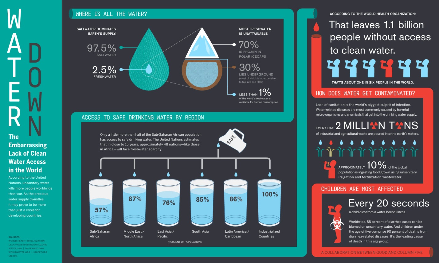
1) Here is a great one on global access to clean water:
Source: http://awesome.good.is.s3.amazonaws.com/transparency/web/1106/clean-water/flat.html
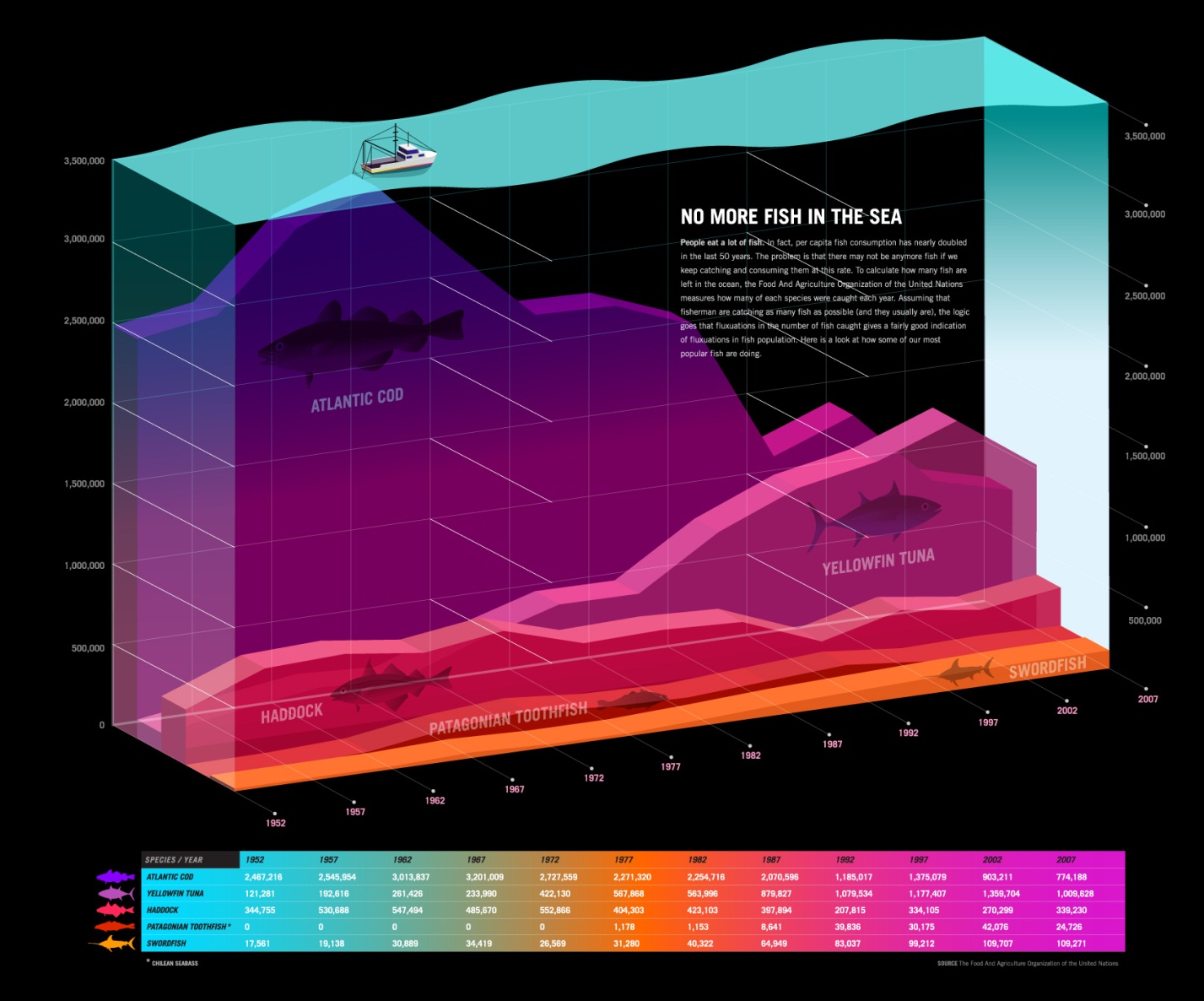
2) This one covers why fish populations are dwindling:
Source: http://awesome.good.is/transparency/web/0905/trans0509nomorefishinthesea.html
3) This useful one speaks to the ways in which we typically waste water at home:
Source: http://www.elocal.com/blog/water-home-wasting-infographic-431
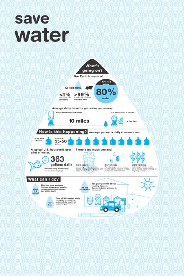
4) Here is one on the importance of conserving water:
Source: http://pixelfox.artician.com/portfolio/Save-Water/
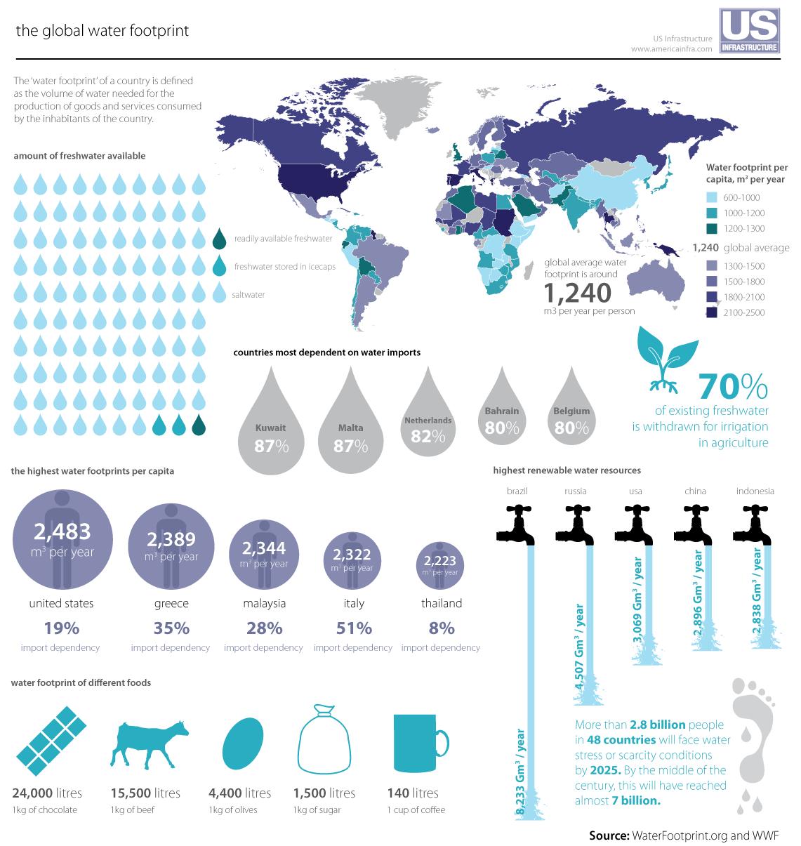
5) Lastly, this one does a great job showing the global water footprint:
Source: http://www.nextgenpe.com/news/global-water-shortage/
There are many other interesting infographics out there about water topics. If you know of any good ones, please let us know and perhaps we can do another list: e-mail Charles at CharlesS@Seametrics.com


