Infographics have grown leaps and bounds beyond the PowerPoint SmartArt of yesteryear. Charts and bubbles have given way to dynamic representations that can distill reams of data into one easy-to-understand picture.
They are a great way to get information fast, and listed below are 10 of the best, most relevant infographics pertaining to the agricultural industry.
1. Farming First: “The Story of Agriculture and the Green Economy”
This award-winning infographic is actually a series of 17 graphics that are combined to tell the story of how agriculture can contribute to a green economy in America. It poses six questions to readers in a progressive drop-down format that addresses issues like sustainable supply chains, reducing poverty through green agriculture and answering the food needs of future generations.
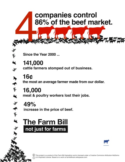
2. FarmBillHack: “Consolidation of the Meat Industry”
This infographic published by Food + Tech Connect and winner of its Farm Bill Hackathon contest takes a sharp look at the farm bill as it relates to what is happening in the meat industry. The illustration argues that the consolidation is ruining the market for U.S. beef by putting ranchers and workers out of business and ultimately raising the price of meat.

3. LiveScience: “Green Acres”
Ross Toro provides a quick snapshot of American farming in 2011 in this infographic. Readers are invited to consider how many farmers there are in America and how many of their fellow Americans they feed, as well as how many people they employ and how much of their food is used for export.

Source:LiveScience
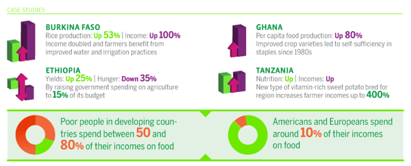
4. ONE, Living Proof and GOOD: “The Agricultural Multiplier Effect”
The dynamic infographic created through a partnership of three different companies that promote environmental stewardship and healthy living demonstrates how smart agricultural investments can improve crop yields while also bettering the protection of the environment.
5. Frugal Dad: “The Consolidation of American Food”
Industry consolidation is a big issue in American agriculture, and this infographic takes a more tongue-in-cheek approach to these concerns. The piece begins by using the fact that 30% of all turkeys consumed this Thanksgiving (2011) were produced by Butterball and then proceeds to apply this measurement to other top food producers.
Source: Frugal dad
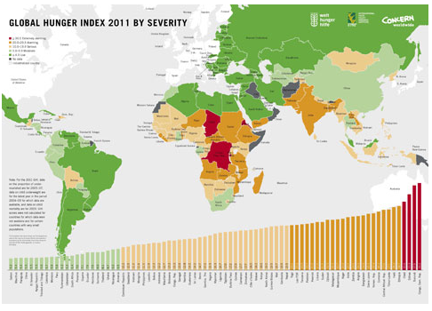
6. International Food Policy Research Institute: “Global Hunger Index 2011 by Severity”
The pervasiveness of starvation around the globe is crystallized in this effective infographic from the IFPRI. As made evident by the red and orange areas on the map, Africa leads the world in its need for food.

See full infographic
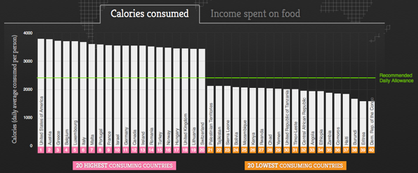
7. Food Service Warehouse: “Visualizing the World’s Food Consumption”
This interactive infographic was ostensibly created to demonstrate the differences in food consumption around the world. As pertaining to agriculture, however, it also provided detailed information on how much income is spent on food in different areas, revealing the differentiation between food cost and availability.
8. USAID: “The Global State of Agriculture”
The U.S. humanitarian assistance organization provides this infographic to illustrate the need for increased food production by emphasizing the boom in the global population. The planet now supports 7 billion people, and USAID estimates food production must increase 70% by 2050 to meet the growing need.
9. EcoPolitology: “Cornfields vs. Oilfields”
The message in this infographic is that the increased use of ethanol is a viable, cost-efficient and environmentally-friendly alternative to gasoline for use in America’s vehicles. The benefit of the analysis is that it illustrates the pros and cons of the plan in a way that is balanced and clearly represents both sides of the issue.

Via: OnlineSchools.org
10. Public Health Program: “The Two Sides of the Food Crisis”
This is yet another in-depth look at the challenges agriculture will face in the coming years. It predicts agricultural production will slow in the near term, food prices will rise due to lower supply, higher demand and more production costs associated with adapting to climate change, farm encroachment and other factors that will impact the industry.

Created by: Public Health Degree


